
A U-shaped kitchen loses its point when one side disappears behind a giant island. These rooms keep all three counter runs visible, then use the island for a specific job—prep, storage, seating, or the sink—without choking the aisles.
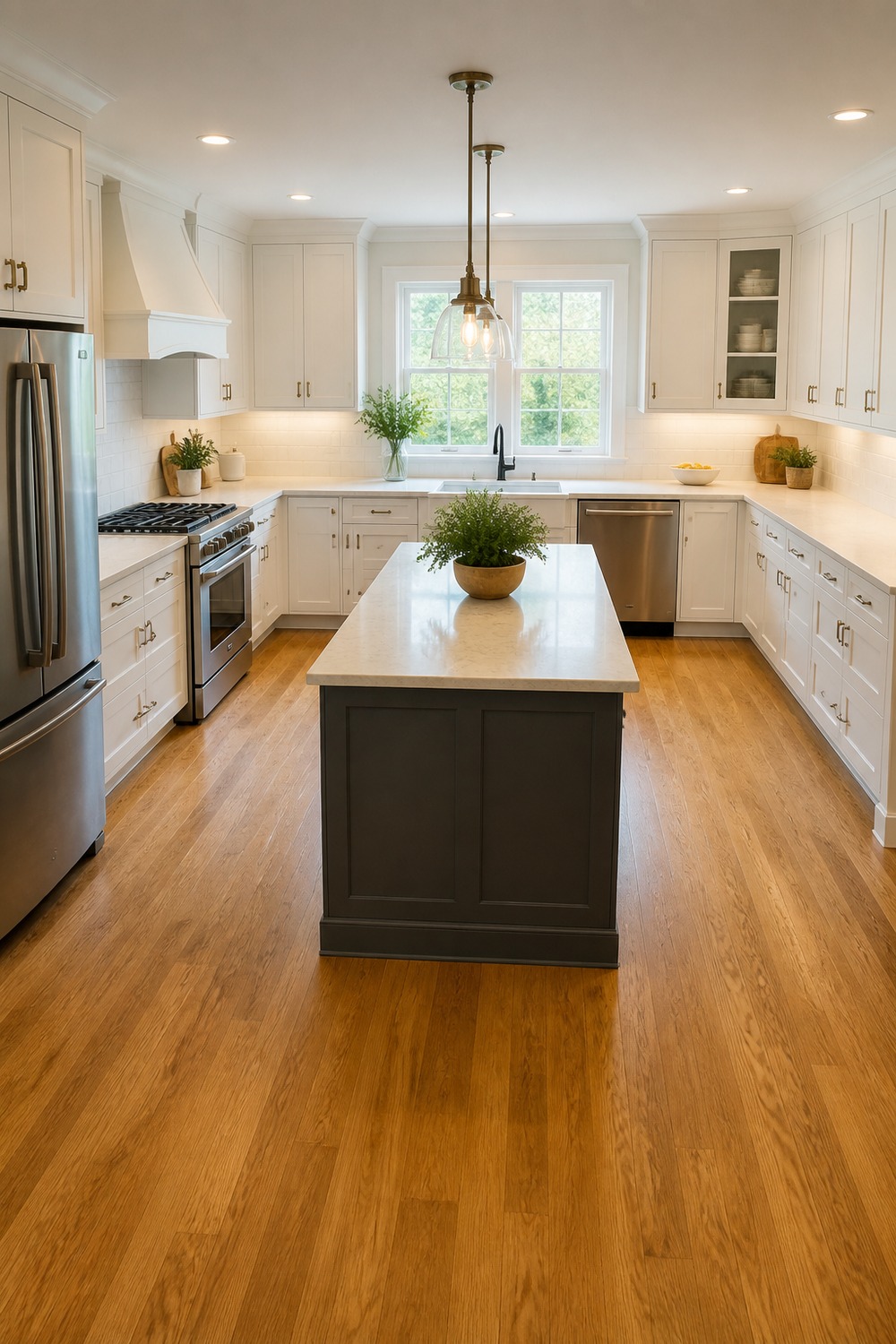
The white perimeter makes the actual U easy to read: sink wall at the back, full counters on both sides, and a charcoal island floating between them. Deep drawers in the middle would keep prep tools close without stealing corner storage.
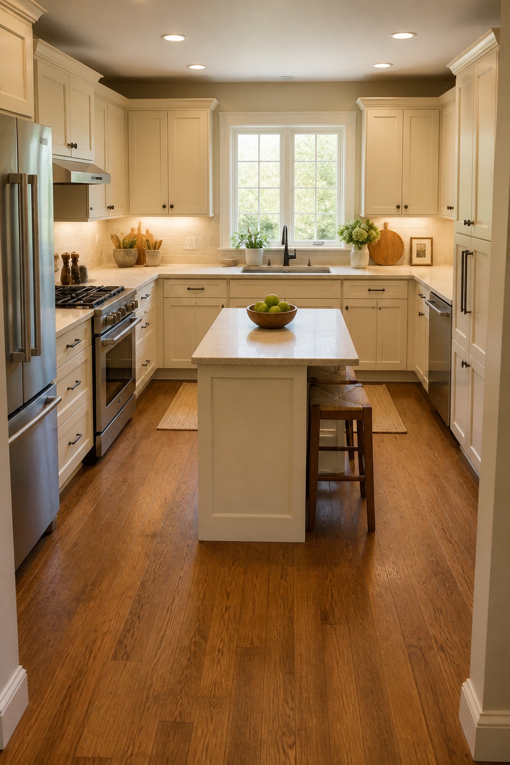
A compact island works here because it stops well short of both side runs. Cream cabinets soften the narrow footprint, while the open floor around the island leaves room for the refrigerator and lower drawers to swing freely.
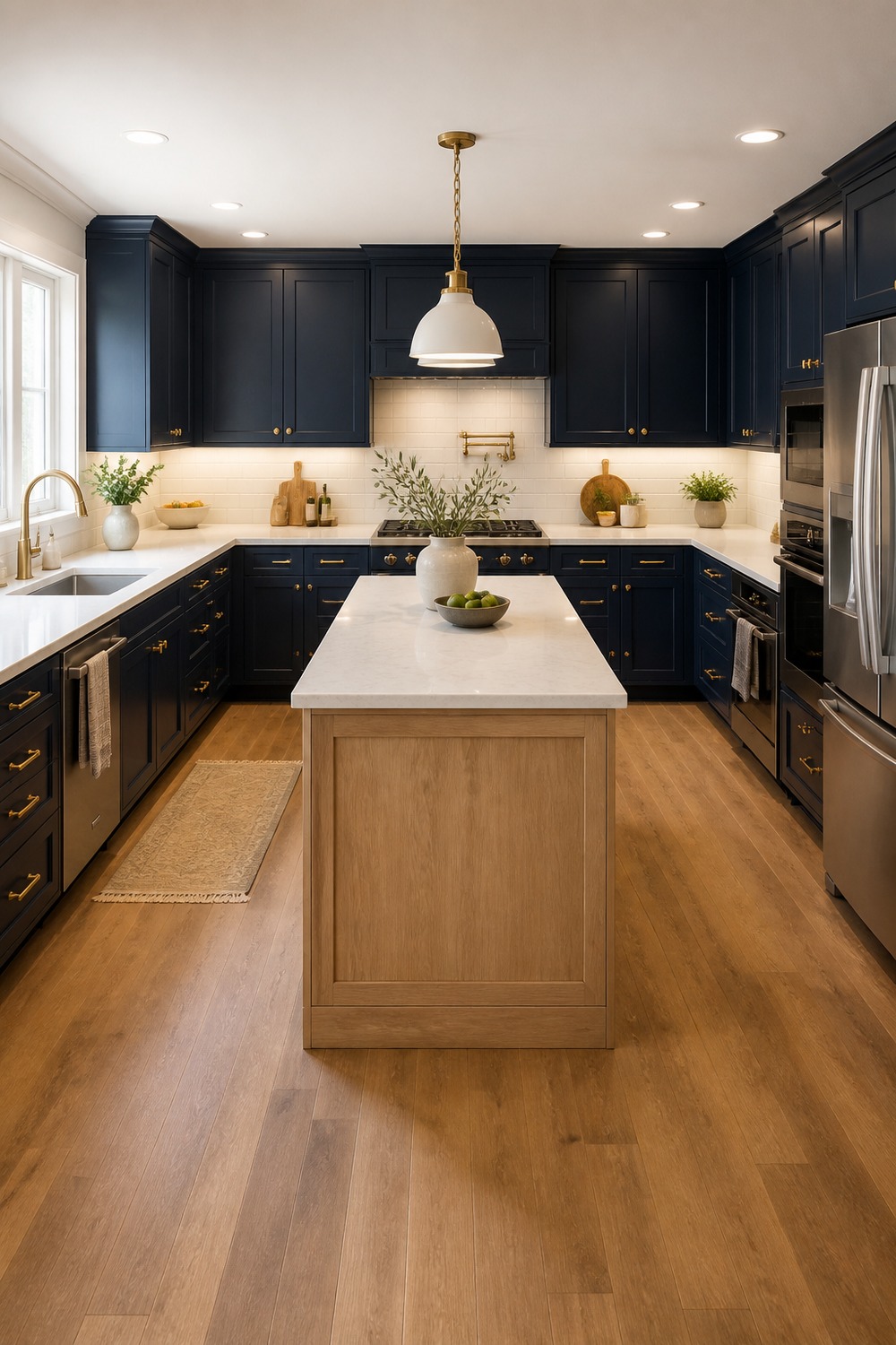
Navy cabinetry gives the three-sided plan real definition, and the pale oak island keeps the center from feeling too heavy. Brass pulls and simple pendants add contrast without distracting from the walkways.
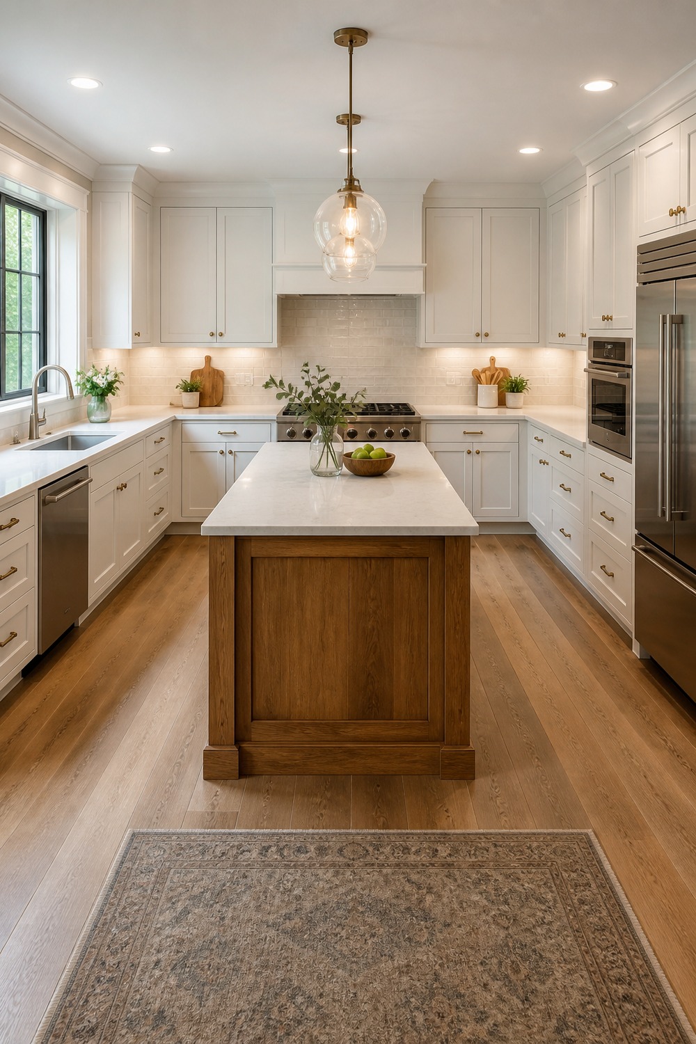
This is the classic version I picture when someone says U-shaped kitchen with an island. White perimeter cabinets handle the appliances, while the wood island brings in a furniture-like focal point and a warmer place to gather.
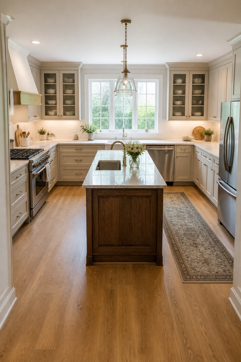
Putting the sink in the island creates a generous prep zone facing the room. The glazed uppers and long side counters still carry the visual weight, so the island reads as a separate worktable rather than a fourth wall.
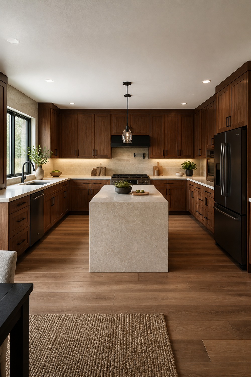
Walnut across all three sides could have felt dark, but the cream stone island breaks up the wood beautifully. I also like the under-cabinet glow here; it keeps the back work zone useful after the window light fades.
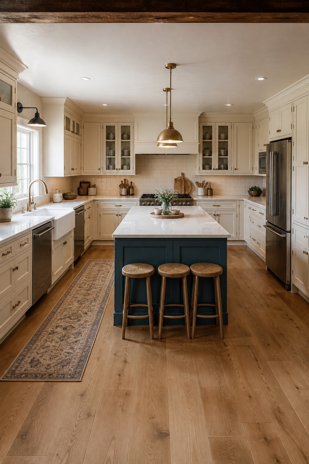
The blue island gives this farmhouse kitchen one strong color moment without painting every cabinet. Seating stays on the outer edge, which protects the working aisle inside the U from chair traffic.
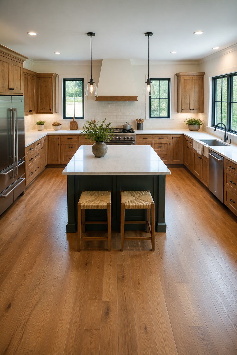
Centering the range on the back wall makes the layout feel intentional from the entrance. The dark island adds a second anchor, while the oak side runs keep everyday dishes and cooking tools within a short reach.
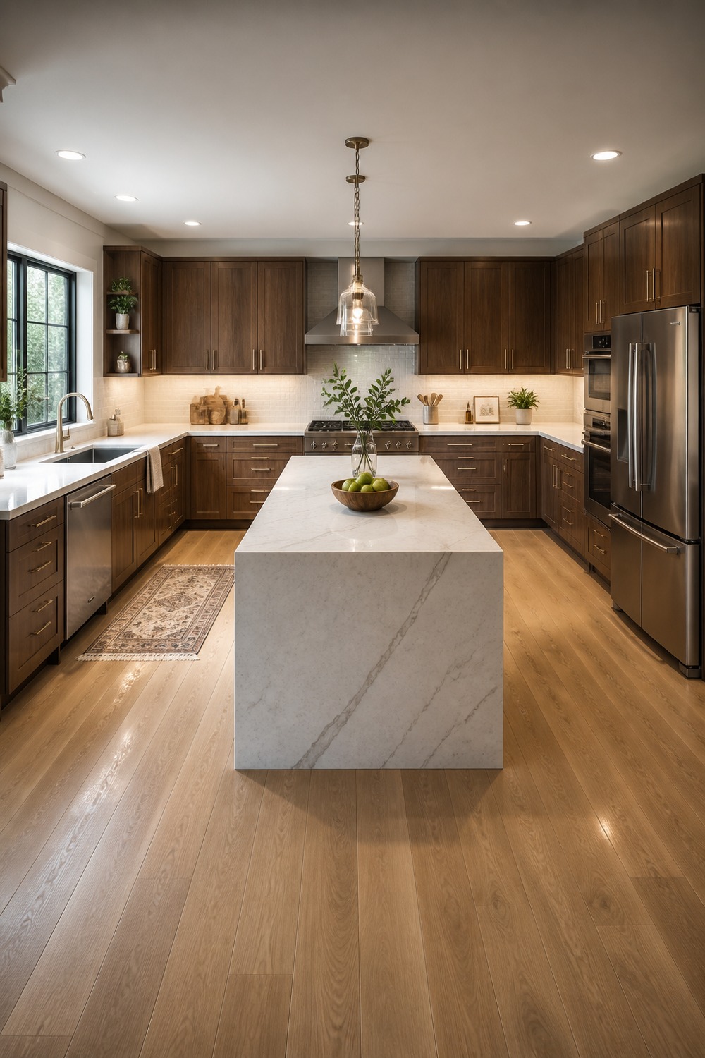
A waterfall edge makes the island feel crisp and architectural against the dark flat-panel cabinetry. Because the floor line remains visible on both sides, the dramatic stone block does not get confused with a peninsula.
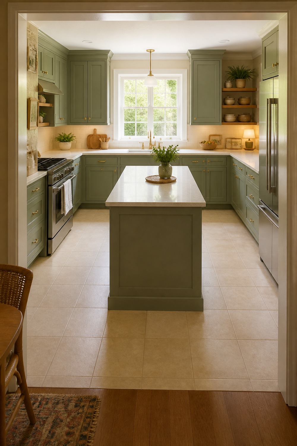
Sage green is doing more than adding color here; it outlines the left, back, and right runs in one continuous sweep. The matching island keeps the palette calm, and the pale counters prevent the center from looking bulky.
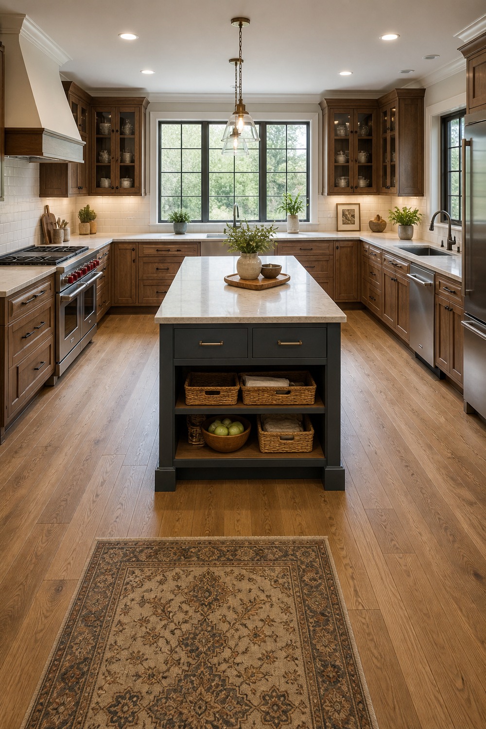
Open shelving on the island is handy for baskets and larger serving pieces that never fit neatly in upper cabinets. The surrounding wood drawers can handle the less attractive clutter, so the center stays useful without looking overfilled.
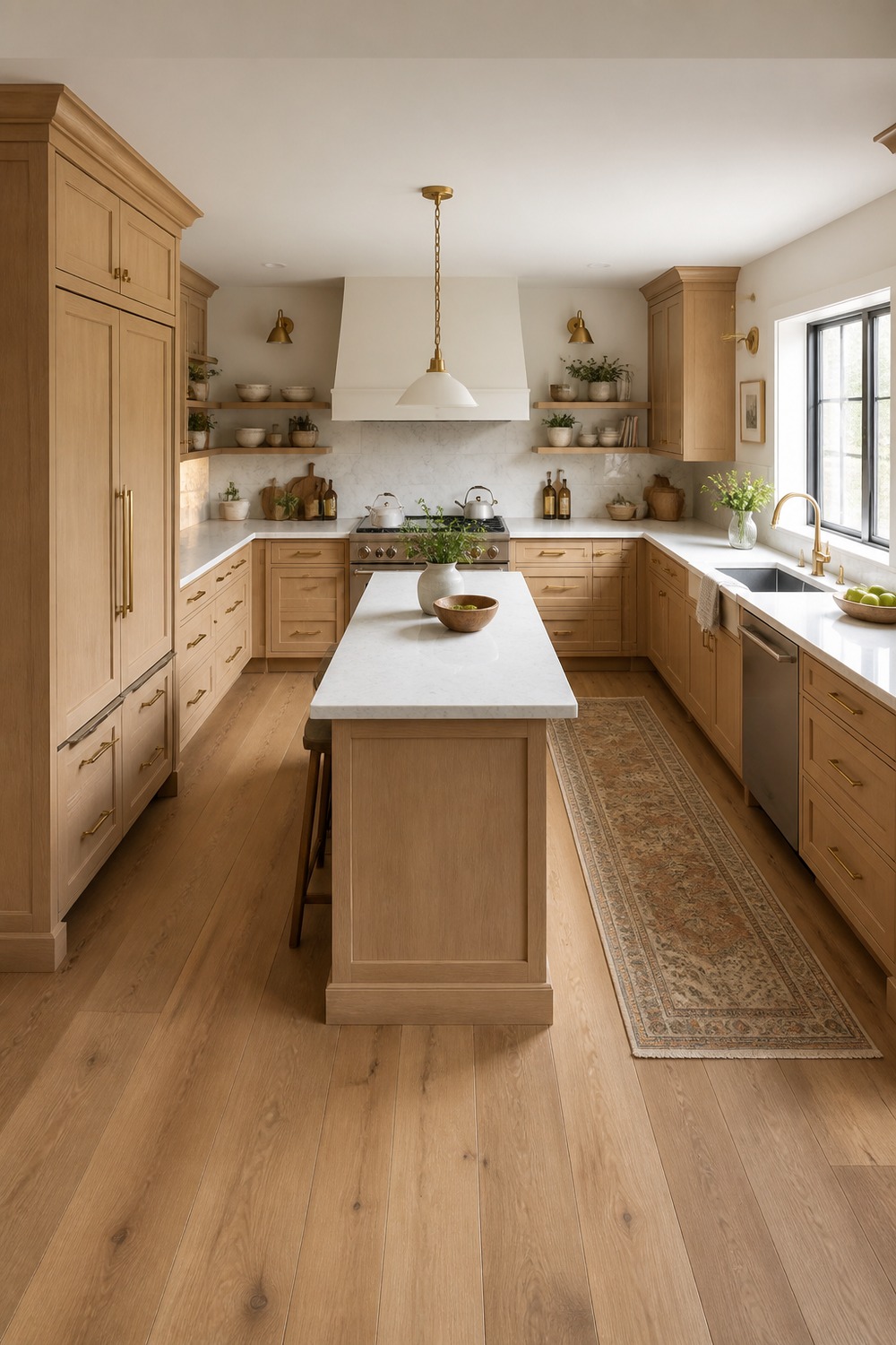
The tall pantry bank on the left gives this U a strong endpoint, while the sink run continues beneath the right-side window. A narrow island suits the proportions and preserves two proper working aisles instead of forcing a tight squeeze.
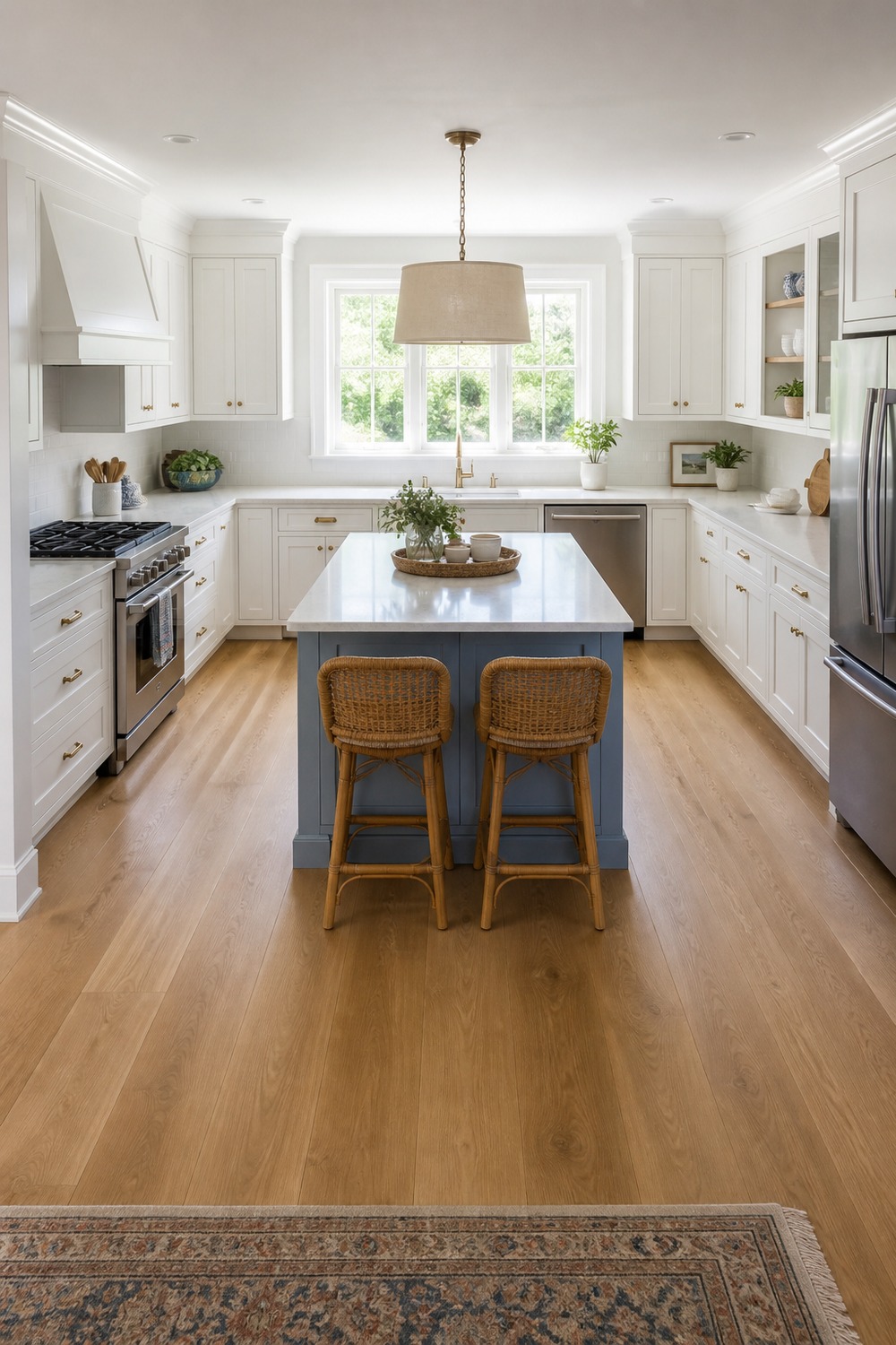
That soft blue island feels right in a coastal kitchen because it echoes the lighter finishes rather than shouting for attention. Woven stools tuck under the outer edge, leaving the cabinet side clear for prep storage.
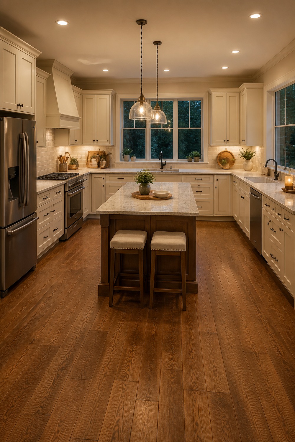
Warm evening light changes the mood, but the layout still reads instantly. A long runner protects the busiest aisle, and the small island leaves enough clearance for two people to work on opposite sides.
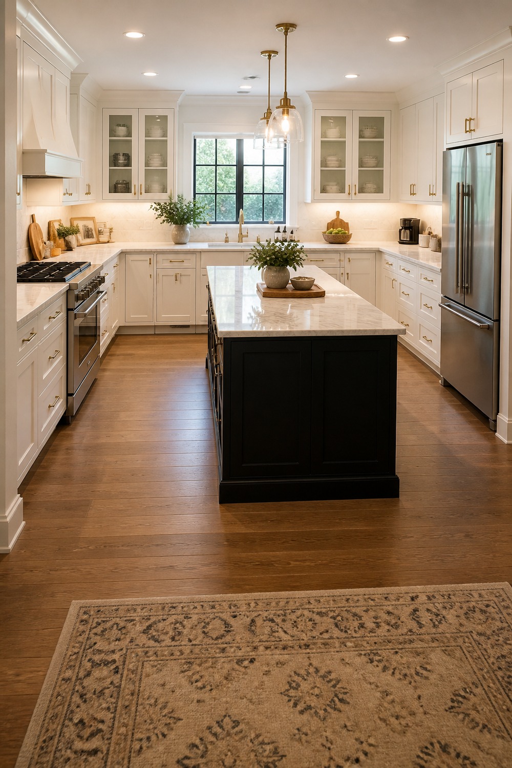
The black island gives the white U a clean focal point and makes the pale perimeter feel even brighter. I would use those island drawers for pots and mixing bowls so the main prep surface stays clear.
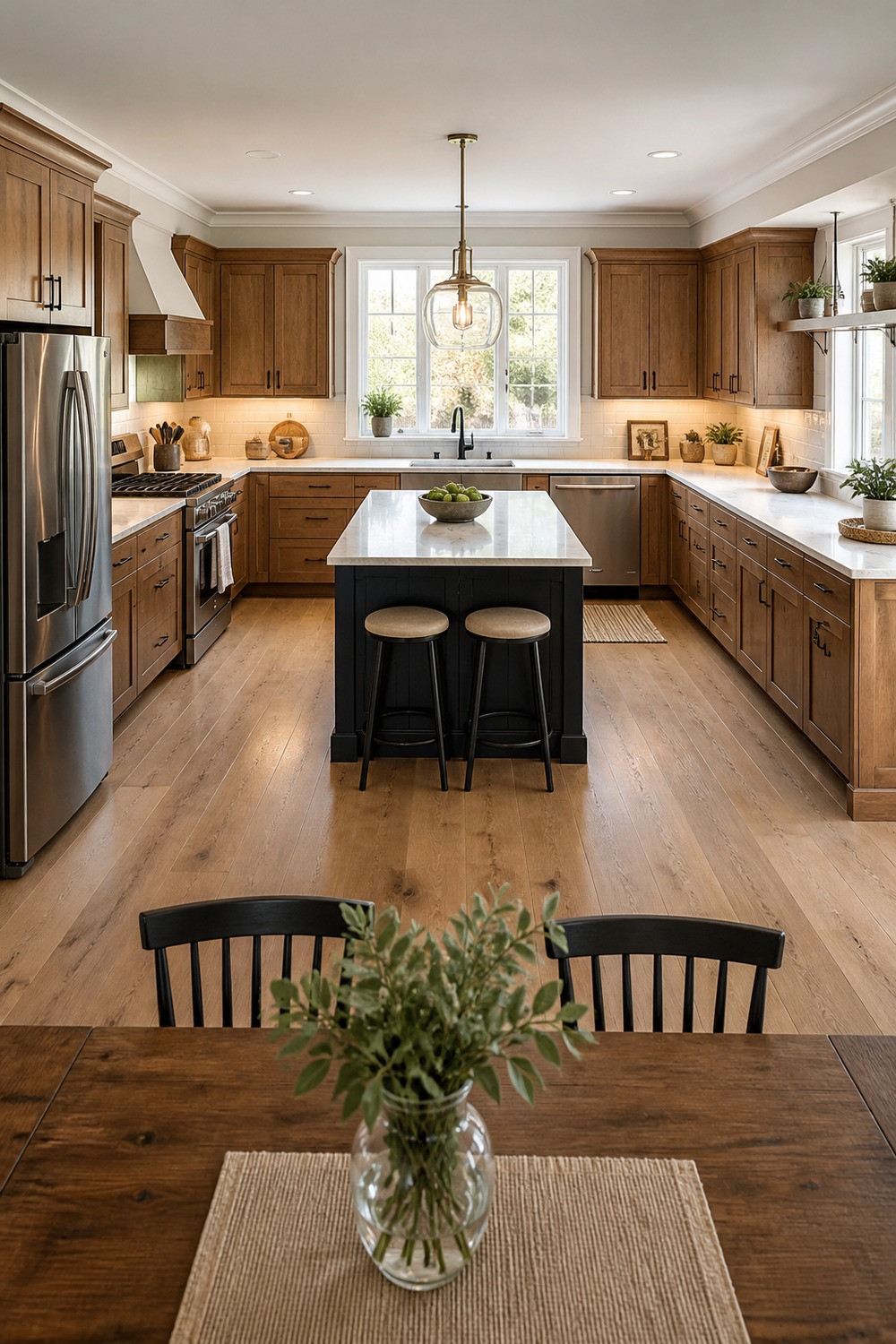
Opening the kitchen toward the dining area is much easier when the island remains fully inside the U. The dining table gets its own zone in front, so stools, chairs, and cabinet doors are not all competing for one walkway.
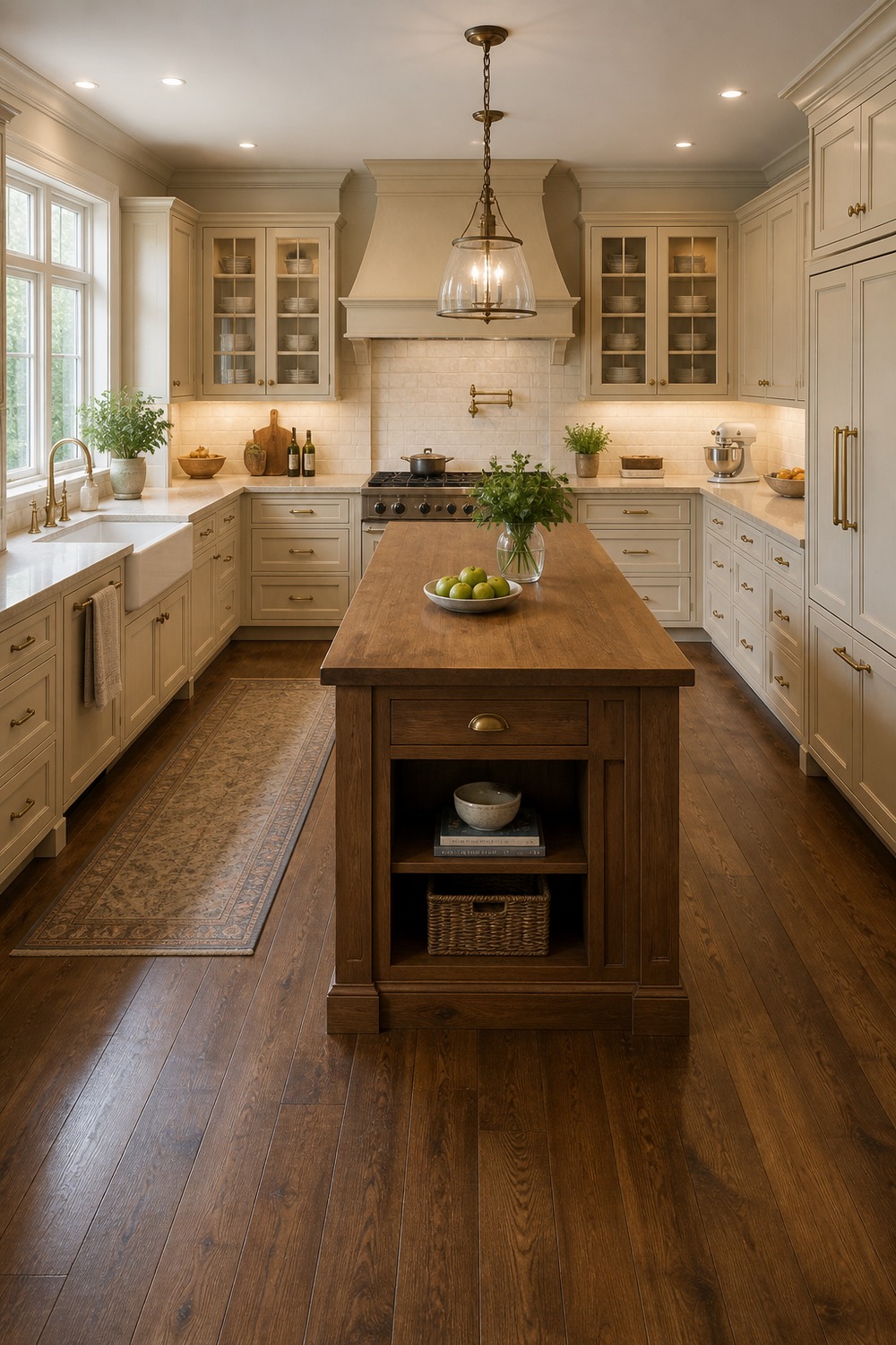
Inset cabinetry and a furniture-style wood island give this one a more traditional rhythm. The darker center also hides everyday scuffs better than a pale painted base, which matters in the busiest part of the room.
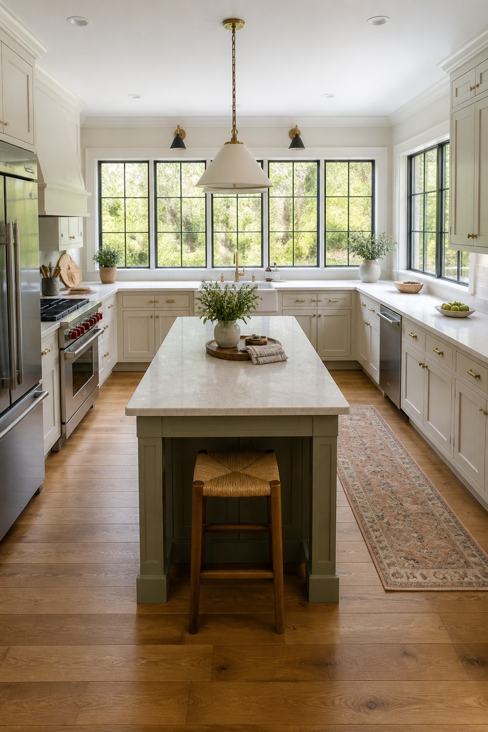
Corner windows are the detail that makes this layout special. They wash both side returns with daylight, and the gray-green island adds storage without blocking the view across the counters.
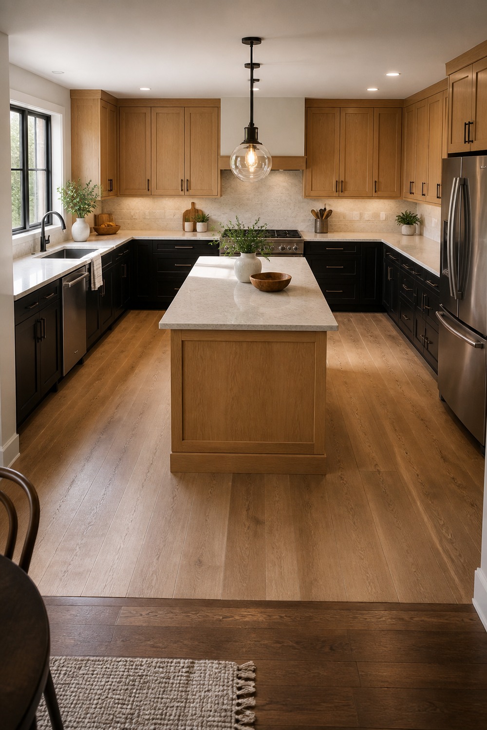
Black lower cabinets ground the perimeter while oak uppers keep the room from turning severe. The natural-wood island bridges both finishes, so the mixed palette looks collected rather than split into separate zones.
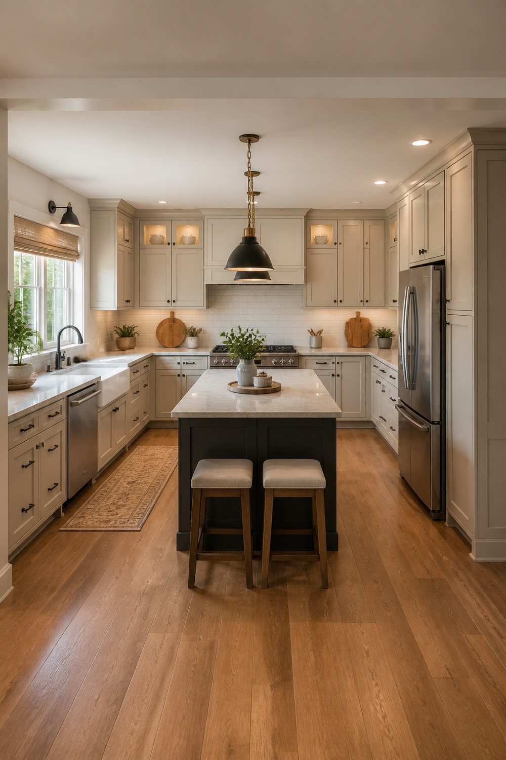
This island earns its footprint with prep space, storage, and two tucked stools. The key is that seating faces outward; someone can sit down without stepping into the cooktop-to-sink path inside the U.
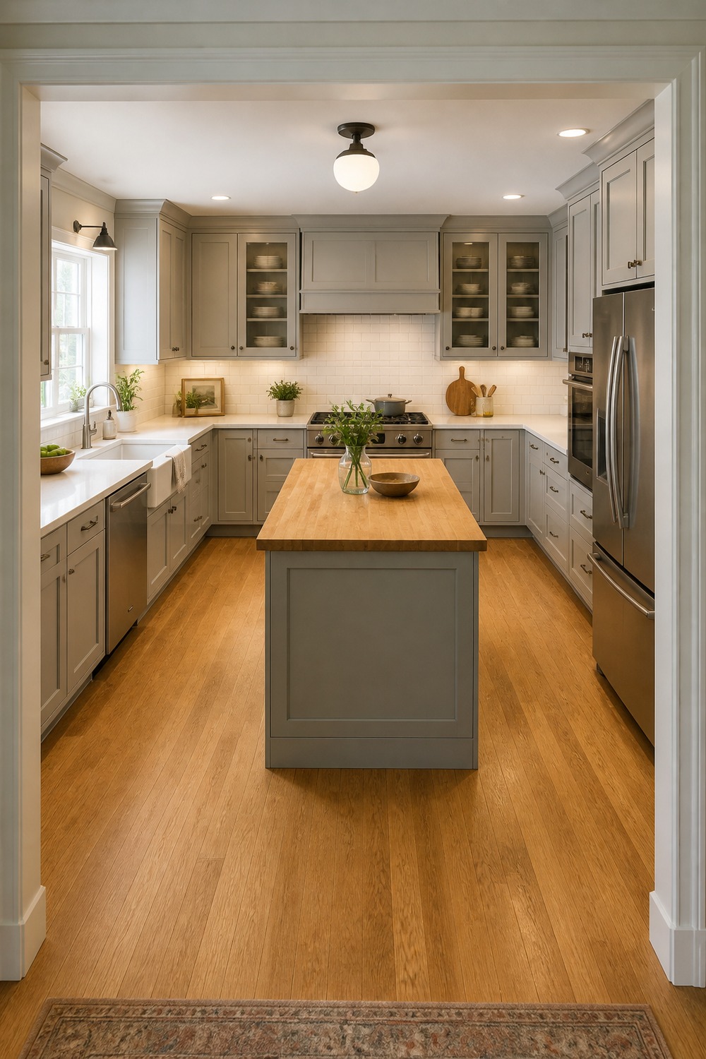
Butcher block on the island introduces a warmer work surface against the soft gray cabinetry. It also gives the center a clear purpose for chopping, baking, or setting down groceries while the stone perimeter handles wet tasks.
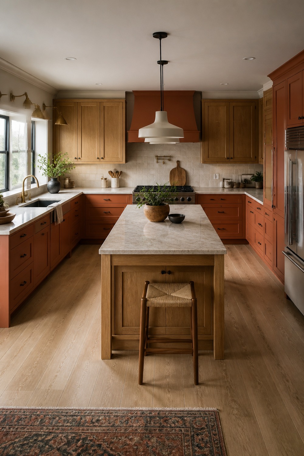
Terracotta lower cabinets make the U-shaped outline impossible to miss, especially against the oak uppers and pale walls. The wood island adds another earthy layer without matching the perimeter too perfectly.
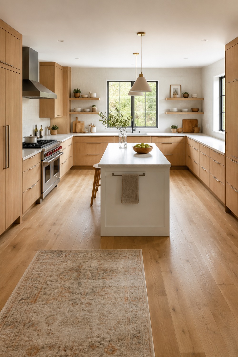
The light oak fronts and slim white island make this Scandinavian version feel airy even with cabinetry on three sides. Minimal hardware and open counter space let the geometry, rather than decorative clutter, carry the room.
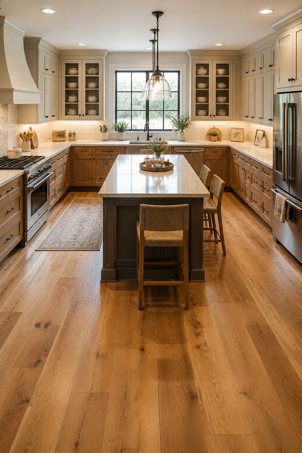
This final view gets the proportions right: a complete U for storage and appliances, then a detached island with seating and visible floor around it. It feels finished, but you can still understand how people would move through the kitchen.
The best examples make the shape obvious before you notice the cabinet color. When the island has clear floor on every side and the perimeter still works as one connected U, the decorative choices can be as quiet or bold as the room needs.
Leave a comment